Data Tuesday: Human Geography NYC
A Snapshot of NYC’s Human Geography
Summary: The author presents a series of dot maps visualizing demographic patterns across New York City using American Community Survey data, covering metrics including maternal fertility, educational attainment, household income, rental costs, and home language. The author argues that dot maps are an underutilized visualization technique for representing human demographic data and explains the methodological decisions made in constructing these maps, including data sources and how different dots are scaled to represent varying population sizes.
I had a lot of fun last week looking at how the demographics of Chicago changed between 1940 and 2020. If you want to check out those maps, you can see the article here—please go like and restack the article to boost it in the algorithm!
In order to construct those maps, I made two stylistic decisions. First, I wanted to focus on just Chicago. The logic behind this was that it would allow the readers to better get a feeling of how the demographics of that city changed without being overwhelmed by too much information. Second, I decided to go with a dot map approach rather than something like, say, a heat map. Personally, I think that both of these decisions came with real advantages, and I’m very happy with how the maps turned out!
Nevertheless, I also think that the use of dots to represent Human data is underutilized in general!
With that in mind, I wanted today to focus on America’s largest city, New York, and show some other interesting patterns that exist. All of these maps were constructed using the American Community Survey. This means the maps, if I understand the documentation correctly, reflect an average value over that 5-year period of time. Additionally, since this is the result of a survey, everything should be seen as having error bars. This data can be retrieved by anyone from NHGIS for free(I love America). Once again if there is general interest, I can share the code I used to create them. Similar to last time, I have done nothing particularly sophisticated with this analysis.
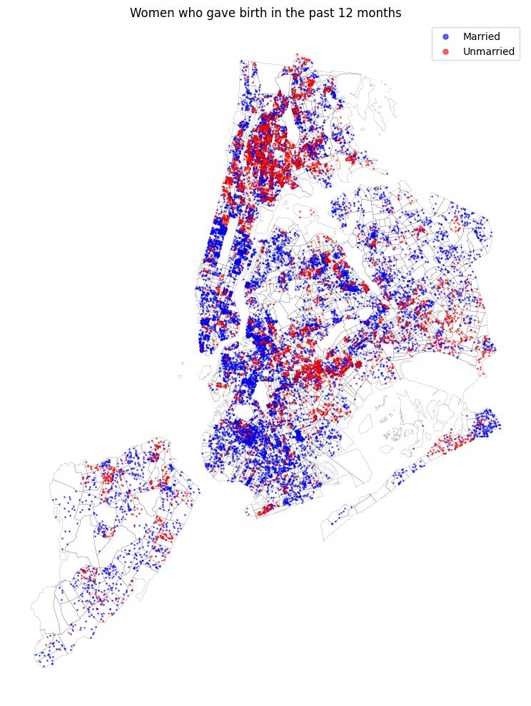
Women who gave birth in the past 12 months:
I’ve broken this down into two categories: married and unmarried women. Each dot represents 5 women and is taken from the 2019–2023 ACS.
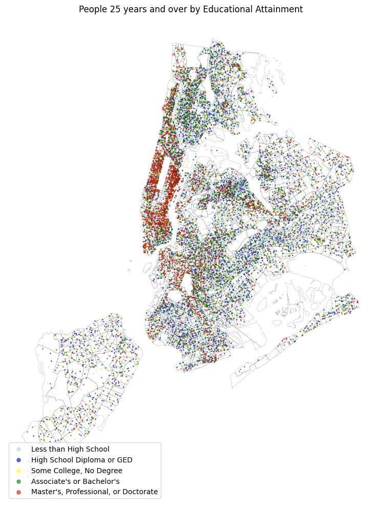
25 years and older by educational attainment:
I’ve grouped these into the following 5 groupings:
Less than High School: includes everyone who didn’t finish grade 12 (from no schooling up through 12th grade without a diploma).
High School Diploma or GED: those with a regular high-school diploma or equivalent credential.
Some College, No Degree: anyone who attended college but didn’t earn an associate’s or higher.
Associate’s or Bachelor’s: holders of 2-year or 4-year college degrees.
Master’s, Professional, or Doctorate: those with advanced degrees (master’s, professional, or doctorate).
Each dot represents 150 people, and this is taken from the 2018–2022 ACS.
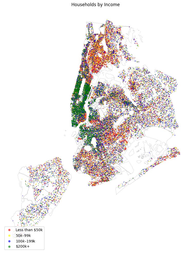
Household Income Level:
Each dot represents 100 households and is taken from the 2019–2023 ACS. The highest level is +200k, so I cannot get more granular than that.
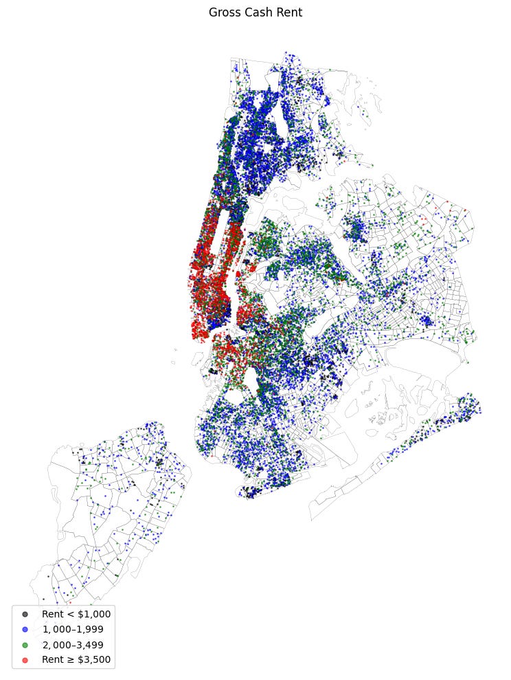
Cash Rent:
Each dot is 100 rental units and is taken from the 2019–2023 ACS.
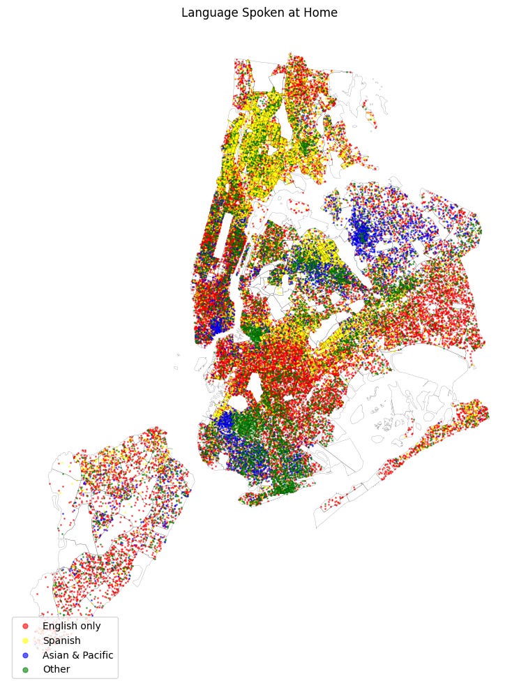
Language Used at Home:
I’ve grouped these into four categories. Each dot represents 150 people over 5 years old. Data from ACS 2019–2023:
English only
Spanish
Asian & Pacific
Other (all other languages)
If there is anything you would like me to investigate in the future please let me know in the comments!