Data Tuesday: Chicago Demographics 1940-2020
9 Maps for 9 Decades
Summary: The essay introduces "Data Tuesday," a weekly series presenting demographic data visualizations. It presents granular racial demographic maps of Cook County from 1940 to 2020, using census tract data where each dot represents 100 people. The author discusses how census racial categories changed over the decades, making longitudinal comparison challenging, and notes that the data does not separate Hispanic ethnicity from race.
Today will be the first article in what I, currently, intend to be a weekly article series I’ll be calling “Data Tuesday”1. The plan for these is to keep the editorializing to a minimum and instead just present some interesting data that I’ve discovered or created.
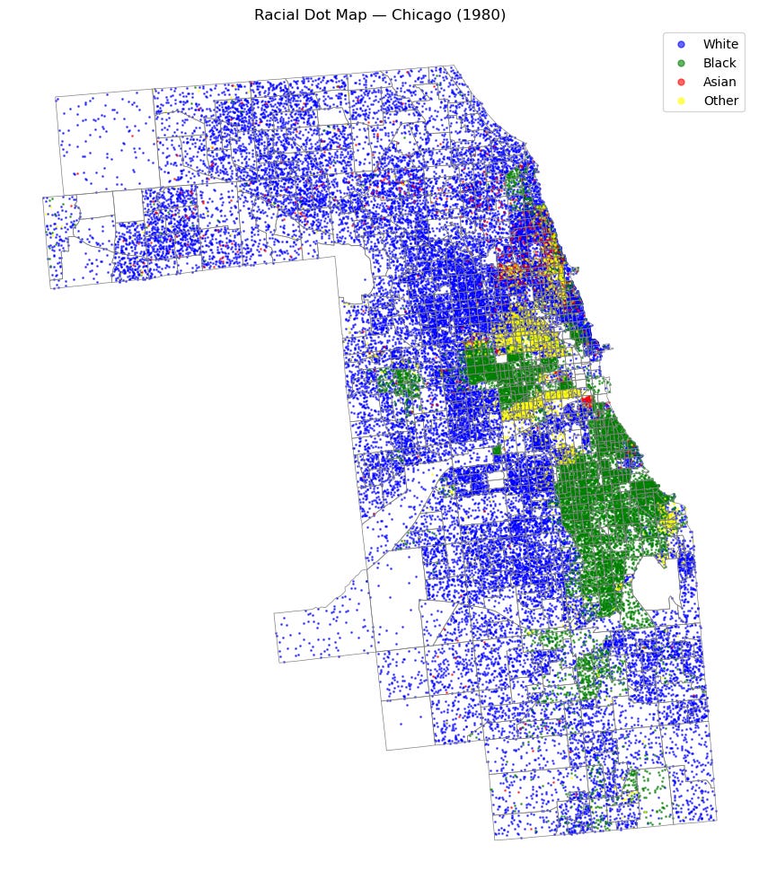
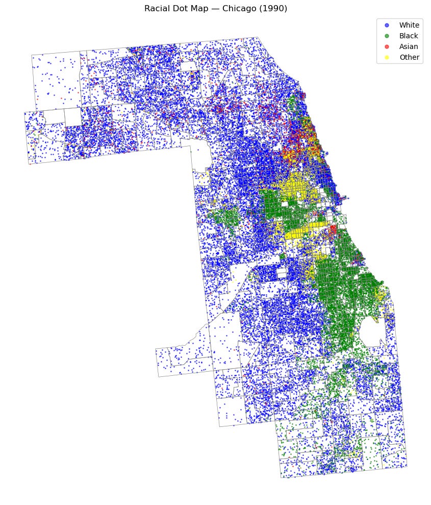
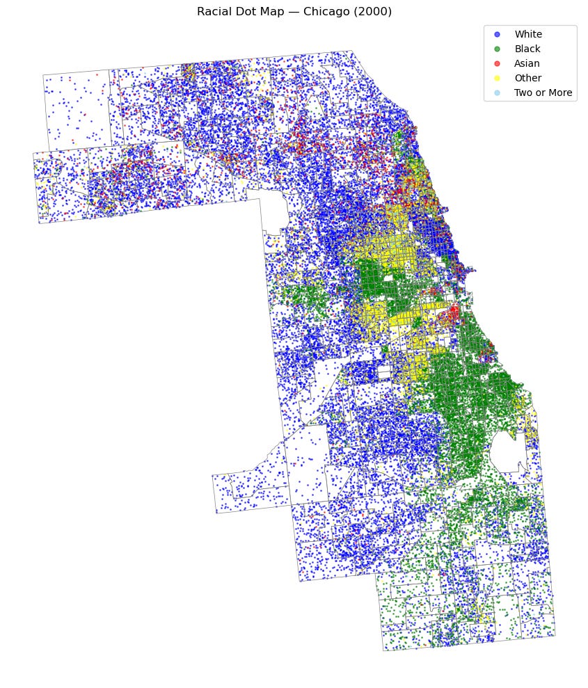
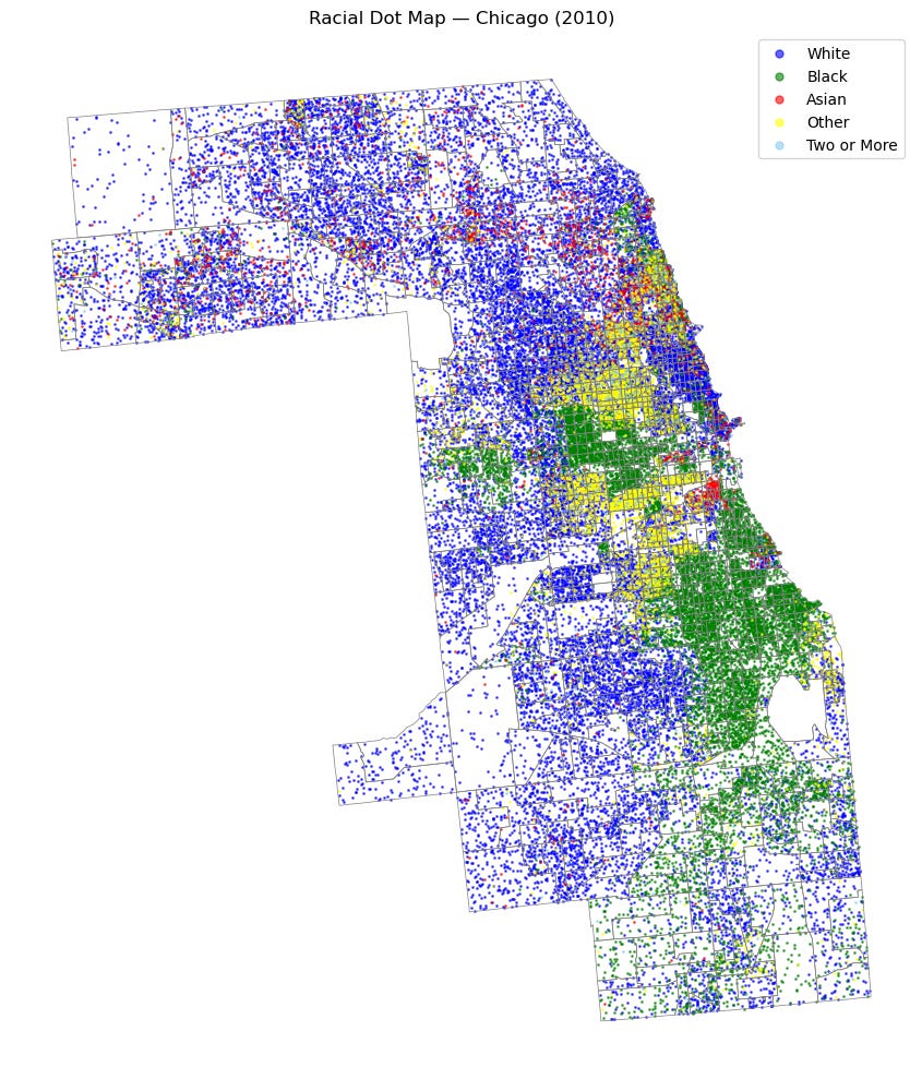
This week I will be showing granular demographic maps from Cook County between 1940 and 2020. I’ve stylistically followed UVA’s racial dot map(which I believe is now depreciated) and am using census data taken from NGHIS. If there is general interest, I will post the code I used to generate these graphics; however, I have done nothing particularly sophisticated.
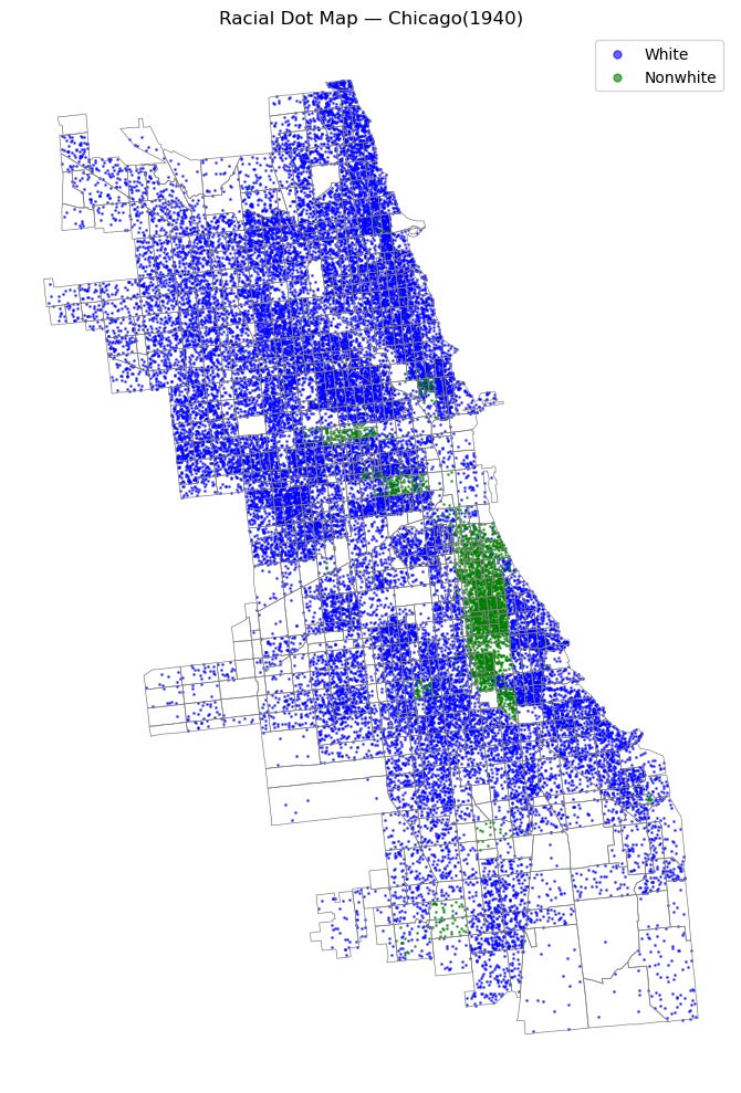
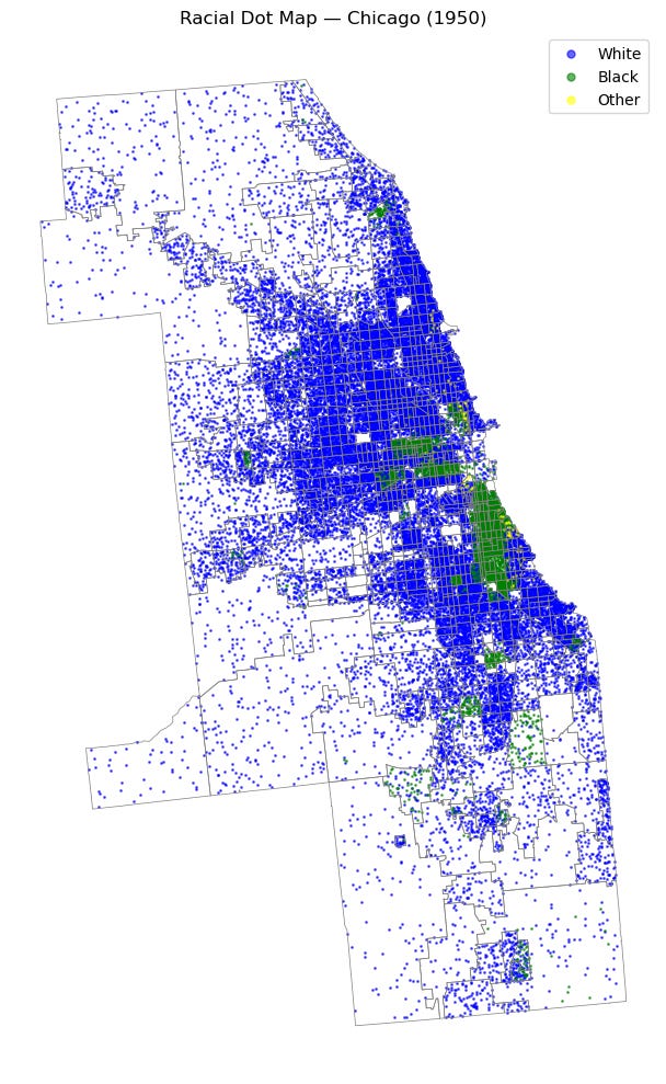
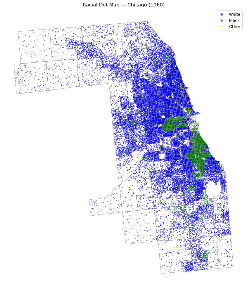
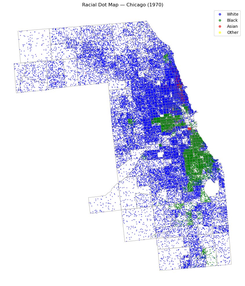
The data will be reported at the census tract level, the most granular I could find regular data for, and each dot represents 100 people of a certain race.
If I do not say otherwise, you should assume the following mapping for these graphics.
Blue: White People
Green: Black People
Red: Asian People
Yellow: Other People
They will also be shown in a key.
Note:
The categories that were reported changed regularly. I will report the groupings that NGHIS gave me, but this does make intertemporal comparison more difficult.
The data I worked with did not separate out Hispanic people for any of the years. I may return in the future with data that includes ethnicity in addition to race—the American census is weird—and update these graphics.
1940:
For this year, the census reported two groups: White and and Nonwhite. Additionally, the data doesn’t appear to cover the entirety of Cook County and focuses only on the “core”.
1950:
This year, the census reported White, Black, and Other.
1960:
1960’s categories are identical to 1950.
1970:
In addition to the prior categories, the dataset I used to construct this—“nhgis0005_ds95_1970_tract”—included a breakdown for various Asian ethnicities such as “Japanese,” “Chinese,” etc., which I have consolidated under “Asian.”
1980:
This census had a marker for Native American, which I have included in Other. Looking at the map, it appears to pick up quite a few Hispanic people, although this isn’t possible to know with certainty and is based only on the scale of the Native population in Chicago and their geographic location.
1990:
I’ve made the choice to group Asian and Pacific Islanders together into a single group I call “Asian” for readability. Once again I also chose to combine Native and Other.
2000:
This census introduces the ability for people to choose more than one race, which is reported as “two or more races.” I leave this as its own category.
2010:
2000, 2010, and 2020 all have the same categories in the data which makes reporting them easy.
2020:
Finally, the most recent census!
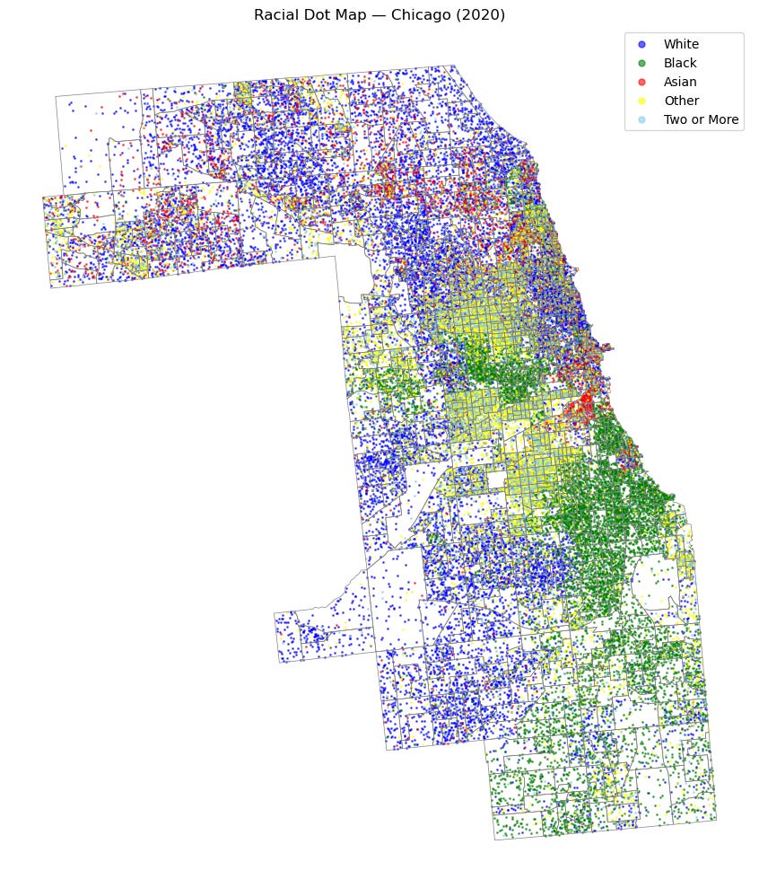
Let me know if anything jumps out to you!
For $5/month or $50/year, you'll gain access to all my paywalled articles(including this one) and earn a permanent spot in my heart.
Hopefully I’ll release it not at 10:30pm on future Tuesday’s but realistically these will come out at random times.